4 Simple ways to choose the colors for your brand
Color plays a HUGE role in the vibe and presence of a brand. The placement, strategy, and use of color can either make your brand appear fresh and modern or old and dated.
A lot of people get really hung up on trying to figure out the perfect balance of color to keep their brand interesting while not being overpowering. Below are 2 simple methods to help you choose the colors for your brand. If you already know what colors you want for your brand, you can use these points to confirm and refine your choices. Overall, you will need 3-4 colors. I recommend one or even two colors being neutral (maybe a light and dark), one color that POPS and the other color/s can play a supporting role.
01 - Take a Step Into Your Closet
A lot of entrepreneurs want their business to represent them personally. For these types business owners I ALWAYS recommend that they take a step into their closet. I know it sounds weird, but some people tend to say, "I don't know what colors to choose…I can't make up my mind." Well, whether you know it or not, you choose color schemes everyday. When you wake up you choose to put on clothing items that represent you. And funny enough, the colors that you are attracted to tend to be the colors that look good on you too. My advice is to take a step inside your closet and notice the colors that you have acquired over the years. Squint your eyes. Do you see mostly dark or mostly light? For neutrals, what shade do you see most? Shades of gray? Or off white? Finally, what is that "pop" of color that is overflowing your closet? Don't be afraid to mix and match and try different hues and shades.
02 - Go Monochromatic
A monochromatic color scheme can look REALLY good, especially when placing it with different photos and images. Monochromatic means all the shades and tints of one color only. Pick your favorite color or choose a color that represents the vibe and emotion that you want your brand to feel like. For example, if your brand is really energetic choose a color that feels bright and bubbly. Then use the light and darker versions of it to complete your color scheme. This look is simple and oh so fresh.
Hopefully, these two suggestions will get you thinking and help inspire you, or even perhaps give you confidence in the colors that you already chose. Even if you are working with our team to develop your brand and website, we LOVE to see the colors and color combinations that you come up with. From there, we edit, narrow down, tweak, and refine to create the brand that represents you and/or your business.
03 - Go Complimentary
Complementary colors are colors that are at opposite ends of the color wheel. For some reason or another they bring a harmonious energy when used together. You could pick one color that you like, (maybe found in your closet) then look up the complimentary color (directly across the wheel) and then choose a light neutral color. That would be a versatile color scheme.
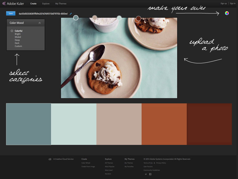
04 - Use Adobe Color CC
I freaking love the color tool by Adobe. It has a lot of cool features that can help you land on a perfect combination. Upload a photo, and it will automatically pull different colors from it. You can explore using a variety of monochromatic and complimentary hues and begin a trial and error process. IT'S ADDICTING!!!
Hopefully, these four suggestions will help inspire you, and perhaps even give you confidence in the colors that you chose. When you land on that perfect combination, you can even give your colors creative names that coordinate with your brand. Even if you are working with our team to develop your brand and website, we LOVE to see the colors and color combinations that you come up with. From there, we edit, narrow down, tweak, and refine to create the brand that represents you and/or your business.


